Visual Feedback: Dialogs, Snackbars and Toasts
Providing visual feedback to the user is very important. In this tutorial, you’ll learn about Dialogs, Snackbars, and Toasts. By Jemma Slater.
Using MaterialAlertDialogBuilder
The MaterialAlertDialogBuilder provides several functions for setting up a dialog. The builder creates an Android AlertDialog using any defined color or shape in the current app theme, as long as the app uses a Material theme. Use this builder to create any of the dialogs defined in the Material Components library.
The builder allows you to chain methods together. The most commonly used methods allow you to add a title, message and buttons with click listeners. Keep in mind that not all methods can be used together in the same dialog. For instance, it is not possible to have a dialog displaying both a message and a list of selectable items using this builder. You can see the full list of available methods in the official documentation.
To use the builder, you need to import it first. Add the following import statement to the top of MainActivity.kt:
import com.google.android.material.dialog.MaterialAlertDialogBuilder
Simple Dialog
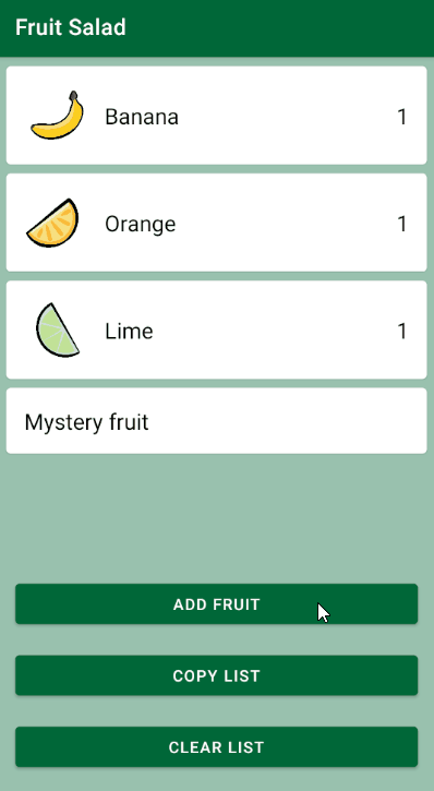
Now, you’re going to display a Simple Dialog showing the three fruit options when the user taps Add fruit. This dialog allows selecting one item. In the project, open MainActivity.kt and find a click listener for the button with ID button_add.

You’ll see that the tap on Add fruit executes showAddFruitDialog(). Replace TODO in this function with the following code:
MaterialAlertDialogBuilder(this)
   .setTitle(resources.getString(R.string.dialog_add_fruit_title))
   .setItems(fruitItems) { dialog, selectedFruitItem ->
     updateFruitQuantity(selectedFruitItem, true)
     dialog.dismiss()
     showSnackbar(selectedFruitItem)
   }
   .show()
This creates an instance of MaterialAlertDialogBuilder and sets a title for the dialog from the string resources. It populates setItems() with the list of fruits stored in the fruitItems value, and within the lambda it defines the click listener for when a dialog item is tapped. Here, the quantity of the selected item is updated, then the dialog is dismissed. The last line of the click listener calls showSnackbar(selectedFruitItem). This function has not yet been implemented, but you’ll address it later in the tutorial. Finally, show() displays the newly created dialog.
Build and run. Tap Add fruit to see how the Simple Dialog looks and select a fruit item. The corresponding quantity value increases as expected and the dialog is dismissed. You can also dismiss the dialog without updating a fruit item by tapping outside of the dialog.

When building your own app, if you want to disable dismissing a dialog without selecting one of the items in a list, chain setCancelable(false) on the dialog builder.
Confirmation Dialog
The Simple Dialog works well for quickly adding a single item, but if you want to allow users to add more than one type of fruit at a time, a Confirmation Dialog is a better fit. The Confirmation Dialog can be configured to allow multiple item selection. It also requires the user to confirm their selection before performing the action.
Now, you’ll implement the Confirmation Dialog. Find showAddFruitDialog() and add the following line at the top:
val checkedItems = booleanArrayOf(false, false, false)
This line creates an array of booleans to hold the state of each fruit item. Initially, they’ll all be unselected.
Then, replace the following line:
.setItems(fruitItems) { dialog, selectedFruitItem ->
     updateFruitQuantity(selectedFruitItem, true)
     dialog.dismiss()
     showSnackbar(selectedFruitItem)
   }
with these lines:
.setNeutralButton(resources.getString(R.string.dialog_cancel)) { dialog, _ ->
      dialog.cancel()
    }
.setPositiveButton(resources.getString(R.string.dialog_add_fruit_positive_button))
    { dialog, _ ->
      checkedItems.forEachIndexed { fruitItem, isChecked ->
        if (isChecked) updateFruitQuantity(fruitItem, true)
      }
      dialog.dismiss()
    }
.setMultiChoiceItems(fruitItems, checkedItems) { _, position, checked ->
      checkedItems[position] = checked
    }
You used the existing MaterialAlertDialogBuilder to create a dialog, and now, besides a title, the builder sets two buttons:
- A neutral button, which cancels the dialog when tapped
- A positive button with a click listener that loops through the checked items, updates the fruit quantity if it was selected, and then dismisses the dialog
setMultiChoiceItems() takes the lists of items and states to display the options inside the dialog. When implementing this in your own app, if you want to restrict item selection to one item at a time, replace this method with setSingleChoiceItems().
The click listener here updates the checkedItems array with the new checked state of the item. This keeps the list of states up to date for when the positive button is pressed.
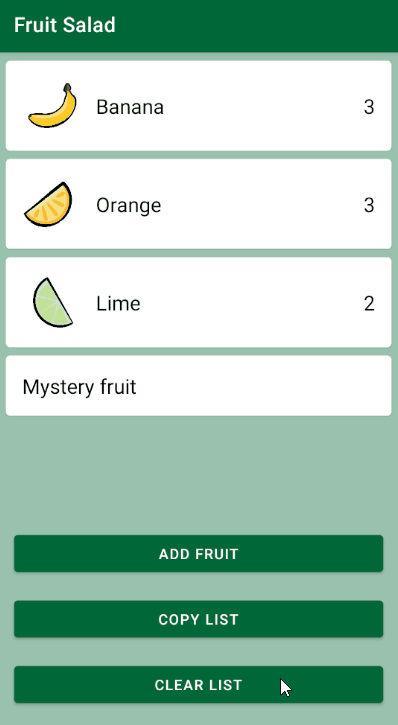
Build and run. Again, tap Add fruit, and this time see how the Confirmation Dialog looks and behaves.
Alert Dialog
Now that you have a dialog allowing the user to add fruit, you need to provide a way for them to clear the list, too. Clearing the list will be an irreversible action, so you need to add a safeguard to prevent the user from doing this accidentally. An Alert Dialog is perfect for this use case because it enables you to display some extra information about the action’s consequences. The user can then either confirm that they wish to proceed or back out before it’s too late.
As before, in MainActivity.kt, find the button with ID button_clear, which already has a click listener set. On tap, it calls showClearListConfirmationDialog().

Replace TODO in this function with the following:
MaterialAlertDialogBuilder(this)
   .setTitle(resources.getString(R.string.dialog_clear_list_title))
   .setMessage(resources.getString(R.string.dialog_clear_list_message))
   .setNeutralButton(resources.getString(R.string.dialog_cancel)) { dialog, _ ->
     dialog.cancel()
   }
   .setNegativeButton(resources.getString(R.string.dialog_negative_button)) { dialog, _ ->
     dialog.dismiss()
   }
   .setPositiveButton(resources.getString(R.string.dialog_clear_list_positive_button
)) { dialog, _ ->
     updateFruitQuantity(null, false)
     dialog.dismiss()
   }
   .show()
Again, you’re using the MaterialAlertDialogBuilder to create and show the dialog. It has a title, message, and neutral, negative and positive buttons. The positive button has a click listener that clears the fruit quantities before dismissing the dialog. It’s good practice to give the positive button a label that describes the action, if possible, to increase clarity and ease of use.
Both the neutral and negative button click listeners close the dialog. dialog.cancel() and dialog.dismiss() do very similar actions, but each can have a different listener attached, so they might have different behaviors according to how you chose to implement them. The most common practice is that dialog.dismiss() is called when the dialog finishes its job and removes it from the screen, and dialog.cancel() is called when the user performs an action to close the dialog.
Build and run. Tap Clear list to display the dialog.
Custom Dialog
Sometimes, you’ll want to show a more unique or complex dialog to your users. By creating a custom dialog, you can define your own layout to display in the main content area of the dialog.
To create the Custom Dialog, open dialog_fruit.xml. This simple layout contains a TextView and an ImageView.

To implement the custom layout in a dialog, you need to extend DialogFragment() and override onCreateDialog(). In the project, open CustomFruitDialog.kt. You’ll see already declared onCreateDialog() which isn’t doing anything custom right now. But that’s about to change. Replace:
super.onCreateDialog(savedInstanceState)
with the following code:
activity?.let {
 val inflater = it.layoutInflater
 AlertDialog.Builder(it)
     .setView(inflater.inflate(R.layout.dialog_fruit, null))
     .setPositiveButton(R.string.dialog_fruit_close) { _, _ ->
       listener?.onDialogButtonClicked()
     }
     .create()
} ?: throw IllegalStateException("Activity cannot be null")
This code first checks that DialogFragment has Activity into which it can be inflated, and throws an error if Activity is null. In this case, the app wouldn’t be able to display the dialog on the screen.
This time, the code uses the Android AlertDialog.Builder class directly to create the custom dialog. setView() inflates the custom layout into the dialog, and setPositiveButton() makes use of the standard dialog buttons. You aren’t required to use the dialog buttons if your custom layout has its own built in.
The positive button’s click listener calls onDialogButtonClicked() from a custom interface, which has not yet been defined.
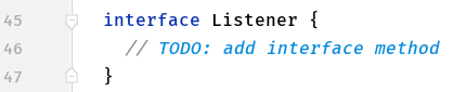
In the same file, find the Listener interface and add the following code in place of TODO:
fun onDialogButtonClicked()
This is an interface method you can implement in any class where you wish to show this custom dialog. In this way, you can change the behavior of the positive button depending on the context of where the dialog is shown.