Visual Feedback: Dialogs, Snackbars and Toasts
Providing visual feedback to the user is very important. In this tutorial, you’ll learn about Dialogs, Snackbars, and Toasts. By Jemma Slater.
Have you ever tapped a button and wondered “did that work?” or “is this doing anything?” while staring at an unchanging screen? Your mobile app is a product that users interact with. Back and forth feedback is crucial to achieving the desired functionality. The app must be told exactly what action the user wants to perform (through their interactions with the interface), and the user needs confirmation that the desired action has been performed. Providing feedback helps build trust, increases user confidence and makes your apps easier to use.
There are several ways to help build this confidence, such as using a simple touch state to show the user the app has registered their tap on a button, a progress indicator to assure the user that something is happening behind the scene or a confirmation message to confirm that an action has completed. Individually, these are relatively small things you can add to your app that, when combined, provide a better, less frustrating experience for users.
In this tutorial, you’ll learn how to:
- Use a variety of Dialogs to display different types of information
- Show touch states and Progress Indicators to reassure users the app is working
- Provide quick updates to users with Snackbars and Toasts
Getting Started
Start by downloading the starter project, using the Download Materials button at the top or bottom of this tutorial.
Open the project in Android Studio and get familiar with the files. Then build and run it on a device to see how the app looks.
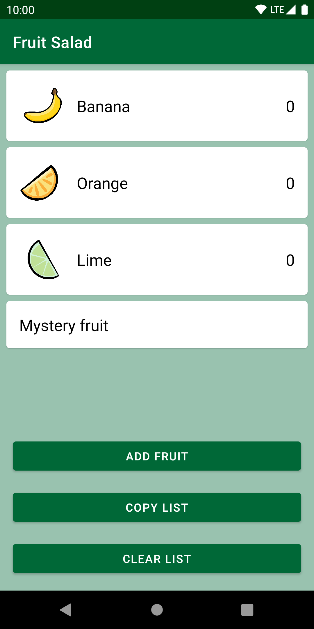
Providing Visual Feedback in Fruit Salad app
The app has a single screen. There are three cards aligned vertically, one for each of the fruits: banana, orange and lime. Each displays an image beside the name of the fruit and the quantity added. The fourth card is actually a button that contains the words “Mystery fruit”. Later, you’ll learn how to display a dialog with an extra fruit item when the user taps this button.
Underneath the cards are three buttons. Initially, these buttons don’t do anything, but throughout this tutorial, you’ll add the following functionality to them.
Tapping Add fruit displays a dialog for adding fruit. The quantity amount is updated on the corresponding fruit card, and a Snackbar confirms which fruit was added and gives the user the option to undo if they picked the wrong fruit by accident.
Tapping Copy list saves a list of the fruits and their quantities to the clipboard on the device. A Toast gives confirmation feedback to the user.
Tapping Clear list resets all the fruit quantities to zero. Because this is an irreversible action, a dialog prompts the user to confirm they’re happy to proceed.
That might sound like a lot to fit into one screen, but each of these dialogs and notifications appears only temporarily. They take up a small area of the screen, yet their effect is mighty!

Touch States
Often when you press a physical button, you feel it move with the force of your finger and hear a click when it catches on. These are little reassurances that the button has been fully pressed and is working as expected. When making a digital product, you need to make considerations for providing the same kind of feedback.
In Android, the standard way to do this is to provide a touch state on anything the user can interact with. This means that while the user is touching the button, the app confirms it has registered the touch by changing the background color. When the user releases their finger, the color returns to normal, or sometimes a ripple effect is produced. Keep in mind that touch states come pre-built into Material Components.
Build and run. Now, tap the cards and buttons to notice this behavior.

The buttons change color with a ripple effect when you touch them, as does the Mystery fruit view. However, you won’t see the color change on the three fruit cards because they aren’t defined as buttons.
In the project, open activity_main.xml and look at the MaterialCardView attributes.

The card with ID card_mystery has two extra attributes defined: clickable and focusable. This tells the component that the card will handle clicks, so the touch state is automatically added.
Dialogs
Dialogs are small, versatile windows overlaid above the main content on the screen. They can be useful for getting the required input from users or making the user aware of important events. However, they block the rest of the content and can disrupt or take over the attention of the user. Therefore, dialogs should be used sparingly and intentionally. In some cases, it might be better to consider redesigning to use overflow menus or a Snackbar, which you’ll learn how to do shortly.
Various types of dialogs cater to different use cases. The Material Components library provides support for three main types:
- Simple Dialog: Displays a title and list of items. This dialog doesn’t have any buttons. Instead, the action is triggered when an item is selected.
- Confirmation Dialog: Similar in design to the simple dialog with the addition up to two buttons: positive and neutral. This type of dialog has the option of multiple item selection and does not trigger an action until the user presses the positive button.
- Alert Dialog: Has optional title, message and up to three buttons: positive, negative and neutral. This dialog is used when the app requires the user to make a decision or confirm that they have read important information.
In addition to the Material Components dialog implementations, you can add your own custom layout to a dialog using DialogFragment.