Your First iOS & SwiftUI App: An App from Scratch


Leave a rating/review
Notes: 05. SwiftUI View Modifiers
Allright! At this point, we’ve created the bones of our user interface.
Right now, we are using the default style for our SwiftUI views, which is quite plain. But as you can see, this doesn’t look very much like Luke’s design so far, does it?
What we want to do is to modify our SwiftUI views so that that they look more like Luke’s design. And you can do that through - you guessed it - SwiftUI View Modifiers.
SwiftUI has a bunch of built-in View Modfiers you can use in your apps to modify the style of your views. For example, there are view modifiers to add a shadow, a corner radius, or a border to your view.
Here’s an example of a view modifier that sets the opacity of a View. If opacity is 0, that means a view is fully transparent, and if it is 1, that means a view is opaque. A setting of 0.5 like you see here is partially transparent.
Text("100")
   .opacity(0.5)
Every time you apply a view modifier like this, behind the scenes SwiftUI is creating a new, modified version of the original view.
You can visualize it like this: first SwiftUI creates the original Text View, then when you apply the opacity modifier, it creates a new View that is a version of the previous view that is now partially transparent.
This is important to understand, because you can apply multiple view modifiers in a row like this:
Text("100")
  .opacity(0.5)
  .border(Color.red, width: 2)
Here we’ve added a second view modifier that adds a red border to the previous view.
Now I want you to ask yourself this question…
…what do you think the border will look like here?
Option A is that the border will be opaque, which means it’s not transparent at all.
Option B is that the border will be partially transparent.
Got your best guess? OK, let’s show the answer.
The answer is Option A: the border will be opaque.
For why this is, think back to the rule we discussed earlier: every time you apply a view modifier, behind the scenes SwiftUI is creating a new, modified version of the original view.
Let’s see how this works.
- First SwiftUI creates the original Text View,
- Second, SwiftUI returns a new view, that is the original text view but partially transparent.
- Third, SwiftUI takes that paritally transparent view, and now adds a red border to it. The border is not transparent, because the border modifier is just adding a red border on top of some transparent text.
So order matters! If you did want the border transparent, you should swap the order like this:
Text("100")
    .border(Color.red, width: 2)
    .opacity(0.5)
This time we’ve applied the border view modifier first, then the opacity view modifier.
The result is this time, the border is partially transparent. This is because we take some text, apply a red border to it, then make the entire set of text plus border transparent.
In this episode, we’re going to try out some view modifiers that are particularly helpful for styling Text Views: .kerning, .bold, .font, .lineSpacing, and .multilineTextAlignment. We will apply these to style the instructions label in the app.
Apply these modifiers using the Object Library:
.bold()
.multilineTextAlignment(.center)
.lineSpacing(4.0)
.font(.title)
This leads me to a discussion of how font sizing works in iOS.
I’m not sure if you know this, but iOS has a way for you to increase, or decrease the font size in apps. This is really helpful for visually impaired people, or for people who want to see more on their screen at once.
However, if you just choose a hard-coded font size for a font, like say 12 points, then your app wouldn’t respect this feature, which might be frustrating for a user.
So instead of hard-coding a font size, Apple encourages you to use built-in text styles that they provide, like the like the .title text style you just saw. There are also styles for headlines, body, captions, and so on. Let’s see how we can choose the proper built-in text style for this label.
Reference for self: https://developer.apple.com/design/human-interface-guidelines/ios/visual-design/typography/
I’ve pulled up Apple’s Human Interface Guidelines, and I’m looking at the chart for Dynamic Type sizes. You can flip between the various settings a user can pick up top.
For this particular text view, I’m giong to pick the text style that is the cloest to Luke’s design when a user is using the default Dynamic Text Size, which is Medium.
Looking at Luke’s design, he chose 13px for the font size. According to the chart, the closest to that is the footnote style, so we’ll use that.
.font(.footnote)
Show how you can change the dynamic type size in the sidebar, and how that updates the Content Previews accordingly. Show how everything resizes itself, including the default unstyled text, since they are using a text style under the hood.
OK, it’s looking pretty close to Luke’s design at this point, but there’s something that doesn’t look quite right, and it’s pretty subtle. Can you notice what it is?
It turns out if you look carefully, the spacing between the characters doesn’t match Luke’s design; Luke has the spacing spaced out more.
To fix that, you need to apply a view modifier called kerning. Kerning is a fancy way of saying “the spacing between characters” in a font. Getting it right can make a really subtle but positive difference, and getting it wrong can have the opposite effect.
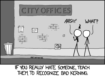
To see what I mean, check out this comic from XCCD. “If you really hate someone, teach them to recognize bad kerning.” I’ve circled the area here in case you didn’t notice it at first. And I’m sorry about that, I don’t hate you! :]
Show how in Luke’s design, the latter spacing is 2px. Try to add it:
.kerning(2.0)
Show an error occurs. Why is that? Look at modifier before in developer docs: SwiftUI \ User Interface \ Views and Controls \ View\ Styling \ Font. Note that font, lineSpacing, and multiLineText Alignment that can be applied to any View since it’s in this category, and it returns a view.
Then look at SwiftUI \ User Interface \ Views and Controls \ Text \ Styling \ kerning. Note that kerning is a View Modifier that can be applied to Text Views only.
Remind them that order matters, and move kerning up until right after or before bold, and it works.